

Dia Browser
It's time to rethink browser should help us to actually browse things.
The Browser Company has finally released Dia even though it’s now just available for Arc members which I’ve previously been into. I’ve been using it for the past week. Here are some of the things I observed:
Introducing a new skill: Chat
When every AI company is building products to bridge AI to customer, Dia just put it inside the thing we touch everyday; browser.
Now, instead of writing the URL of your daily AI product on the browser, you can just ⌘ + E with Dia.
We used to open a new tab to visit websites, now we can do more.
And when we know that it’s living in a browser, that means it lives alongside what we touch, imagine sites just meet AI for the first time and they started to get to know each other.
The magic of opening a new tab
I love the animation when opening a new tab — it guides your attention like waving a magic wand. It brings excitement on possibilities we could achieve.
Making AI feels familiar
Let’s focus on the chat interface, I believe they want to make this as consumer-focused as possible, not just for power users. The animation of sending messages feels like iMessage — casual and familiar.
Even the copywriting uses approachable terms like “Chat” and “Skill” instead of “Ask AI” or “Custom Prompt.” The personalization feature frames prompts in a way that feels like a friend is asking you, reducing the cognitive load.
Another fun thing here is when you enter one of the pre-made skills, it feels like Thanos putting an infinity stone in his gauntlet, that is a good way to give a clue that we’re just activating something and will behave differently.
Shortcuts of productivity
We’re now in an era where we’ve adopted “@” and “/” mentality in using digital products. It’s the quickest and easiest way so far to use a product without having to use our mouse too much on clicking buttons. One of the products that has been using this approach is Notion, and now Dia use it too for mentioning pages and switching between skills
Navigating in Dia is slightly different. Instead of using Control + Tab to go to the next tab, it switches between previous and current active tab, when you get it, it actually feels intuitive, but sometimes the expectation of moving to next tabs still appears.
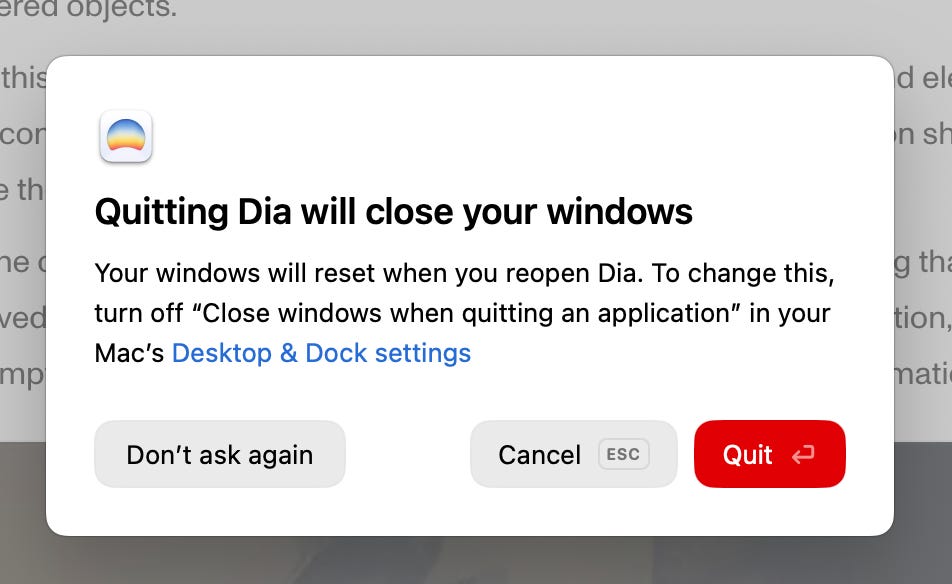
Small detail for someone who prefers to use keyboard most of the time, when you exit, you get a warn that you can easily make a decision with either Enter or Esc.
Some links related to Dia
Designing Dia — behind-the-scenes of designing Dia from its Head of Design
Sidebar prototype — coming really soon
Dia Browser Site — the visuals remind me of the OpenAI website
Recent AMA about Dia — from the CEO of The Browser Company
The Strategy Behind Dia’s Design — another good behind-the-scenes of designing Dia